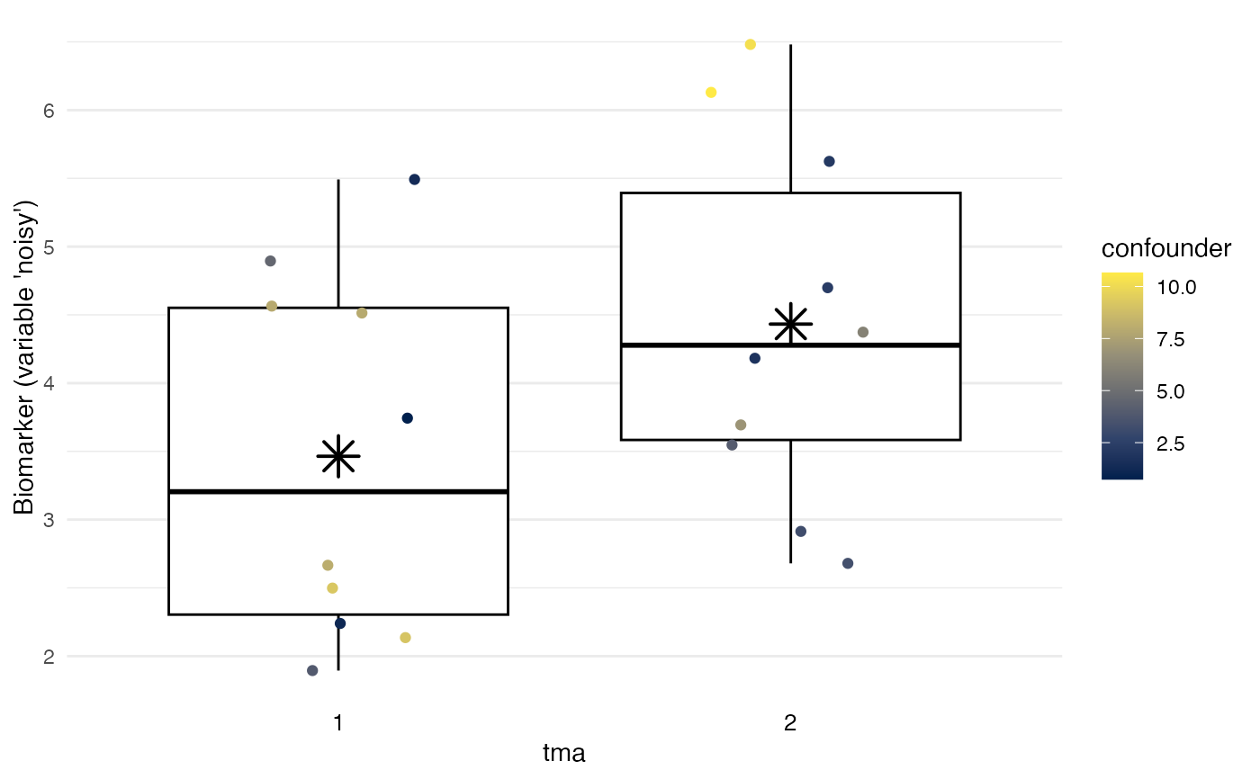
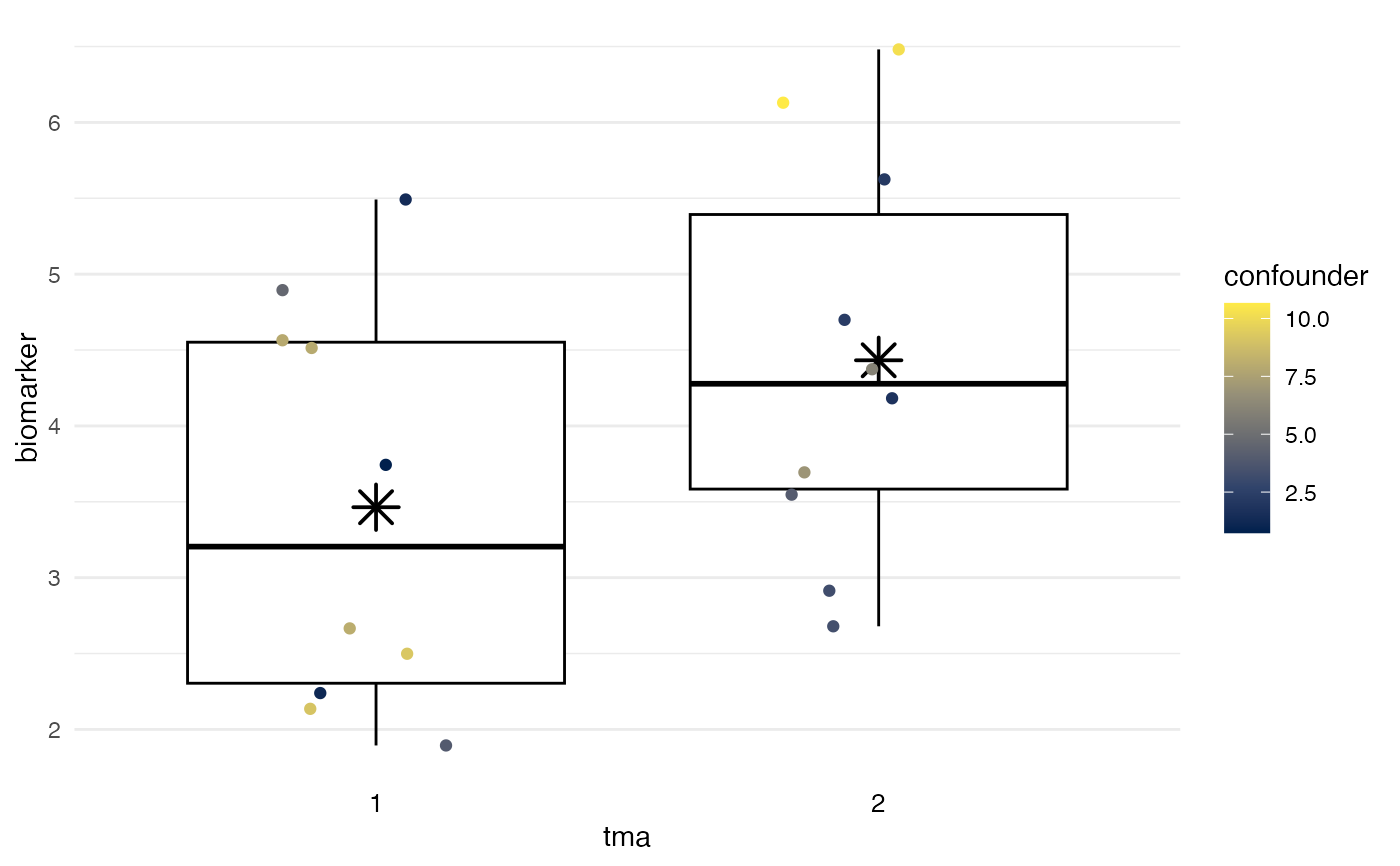
To provide a simple visualization of potential batch
effects, plot_batch generates a Tukey
box plot overlaid by a jittered
dot plot, inspired by the Stata plugin stripplot.
Boxes span from the 1st to the 3rd quartile; thick lines indicate medians; whiskers span up to 1.5 times the interquartile range; and asterisks indicate means.
plot_batch(
  data,
  marker,
  batch,
  color = NULL,
  maxlevels = 15,
  title = NULL,
  ...
)
Arguments
- data
Dataset.
- marker
Variable indicating the biomarker.
- batch
Variable indicating the batch.
- color
Optional: third variable to use for symbol color and shape. For example,
colorcan be used to show differences in a confounder.- maxlevels
Optional: Maximum number of levels for
colorparameter to accept as a discrete variable, rather than a continuous variable. Defaults to15.- title
Optional: character string that specifies plot title
- ...
Optional: Passed on to
ggplot.
Value
ggplot2 object, which can be further modified using standard ggplot2 functions. See examples.
References
Cox NJ (2003). STRIPPLOT: Stata module for strip plots (one-way dot plots). Statistical Software Components S433401, Boston College Department of Economics, revised 11 Oct 2020.
Manimaran S, Selby HM, Okrah K, Ruberman C, Leek JT, Quackenbush J, Haibe-Kains B, Bravo HC, Johnson WE (2016). BatchQC: interactive software for evaluating sample and batch effects in genomic data. Bioinformatics. doi:10.1093/bioinformatics/btw538
See also
More powerful visualizations of batch effects exist in the BatchQC package:
https://bioconductor.org/packages/release/bioc/html/BatchQC.html
Examples
# Define example data
df <- data.frame(
  tma = rep(1:2, times = 10),
  biomarker = rep(1:2, times = 10) +
    runif(max = 5, n = 20),
  confounder = rep(0:1, times = 10) +
    runif(max = 10, n = 20)
)

# Visualize batch effects:
plot_batch(
  data = df,
  marker = biomarker,
  batch = tma,
  color = confounder
)


# Label y-axis, changing graph like other ggplots:
plot_batch(
  data = df,
  marker = biomarker,
  batch = tma,
  color = confounder
) +
  ggplot2::labs(y = "Biomarker (variable 'noisy')")
# Label y-axis, changing graph like other ggplots:
plot_batch(
data = df,
marker = biomarker,
batch = tma,
color = confounder
) +
ggplot2::labs(y = "Biomarker (variable 'noisy')")