Plot bars of proportions that consist of "bricks" showing individual observations.
brickchart(
  data,
  outcome,
  by,
  group,
  colors = NULL,
  guide = FALSE,
  flip = TRUE,
  clip = "on",
  ...
)
Arguments
- data
Data set.
- outcome
Outcome expression, e.g.,
event == TRUE.- by
Exposure variable.
- group
Optional: Grouping variable, e.g., an effect modifier.
- colors
Optional: Color list. Must be a
listconsisting of two-element color code vectors with the dark and bright colors for each level of the exposure variable (by). Example:list(c("darkred", "red"), c("darkblue", "lightblue")). If not provided, colors will be generated from theviridis_palpalette.- guide
Optional: Show legend? Defaults to
FALSE. May not work with ggplot version 3.3.4 or newer.- flip
Optional: Flip x and y axes? Defaults to
TRUE.- clip
Optional: Clip graph? Defaults to
"on".- ...
Optional: further arguments passed to the call of
facet_grid, used forgroup.
Value
ggplot. Modify further with standard ggplot functions. The additional
variables label_outcomes (outcome count), label_total
(per-group total), and label_prop (proportion) can also be accessed.
See example.
Examples
data(cancer, package = "survival")
cancer <- cancer %>%
tibble::as_tibble() %>%
dplyr::mutate(sex = factor(sex, levels = 1:2,
labels = c("Men", "Women")))
cancer %>%
dplyr::filter(ph.ecog < 3) %>% # drop missing/near-empty categories
brickchart(outcome = status == 2,
by = ph.ecog)
 # Stratified version
# Note- Color fill may be off with ggplot v3.3.4+ if guide = TRUE
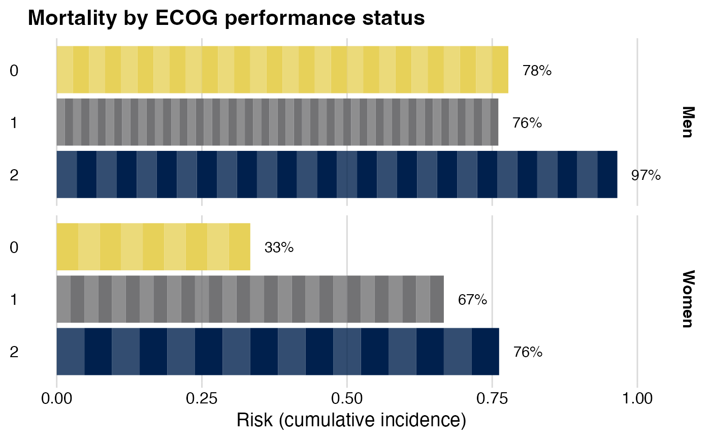
cancer %>%
dplyr::filter(ph.ecog < 3) %>%
brickchart(outcome = status == 2,
by = ph.ecog,
group = sex) +
# Modify graph with standard ggplot functions
# Refer to axes before flipping x <-> y. Here, y is horizontal:
ggplot2::labs(y = "Risk (cumulative incidence)",
fill = "ECOG status", # Color label
title = "Mortality by ECOG performance status") +
# Themes refer to axes as shown--'y' is now vertical
ggplot2::theme(axis.title.y = ggplot2::element_blank()) +
# add label
ggplot2::geom_text(
mapping = ggplot2::aes(
label = paste0(round(label_prop * 100), "%"),
y = label_prop + 0.05))
#> Warning: Removed 159 rows containing missing values (`geom_text()`).
# Stratified version
# Note- Color fill may be off with ggplot v3.3.4+ if guide = TRUE
cancer %>%
dplyr::filter(ph.ecog < 3) %>%
brickchart(outcome = status == 2,
by = ph.ecog,
group = sex) +
# Modify graph with standard ggplot functions
# Refer to axes before flipping x <-> y. Here, y is horizontal:
ggplot2::labs(y = "Risk (cumulative incidence)",
fill = "ECOG status", # Color label
title = "Mortality by ECOG performance status") +
# Themes refer to axes as shown--'y' is now vertical
ggplot2::theme(axis.title.y = ggplot2::element_blank()) +
# add label
ggplot2::geom_text(
mapping = ggplot2::aes(
label = paste0(round(label_prop * 100), "%"),
y = label_prop + 0.05))
#> Warning: Removed 159 rows containing missing values (`geom_text()`).