Plots categorical x-axis and continuous y-axis.
Inspired by Nick Cox's Stata plug-in stripplot. As per
geom_boxplot, boxes reach from the first to the
third quartile; whiskers extend 1.5 times the interquartile range
but not beyond the most extreme data point.
stripplot(
  data,
  x,
  y,
  contrast = NULL,
  unit = NULL,
  digits = 2,
  jitter = TRUE,
  color = NULL,
  na.rm = FALSE,
  printplot = FALSE
)
Arguments
- data
Data frame. Required.
- x
Categorical variable for x-axis. Required.
- y
Continuous variable for y-axis. Required.
- contrast
If added, the mean difference between extreme categories will be added.
contrastprovides the preceding label. See example. Defaults toNULL(do not show contrast).- unit
Scale to print after the point estimate for the contrast between extreme categories. Defaults to
NULL(no unit).- digits
Number of digits for rounding point estimate and confidence intervals of the contrast. Defaults to 2.
- jitter
Avoid overplotting of points with similar values? Defaults to
TRUE.- color
Variable to color data points by. Defaults to
NULL(none).- na.rm
Remove "NA" category from x-axis? Defaults to
FALSE.- printplot
print()the plot? Defaults toFALSE, i.e., just return the plot.
Value
ggplot object, or nothing
(if plot is sent to graphics device with printplot = TRUE).
Standard customization options for a ggplot object can be added
on afterwards; see example.
Examples
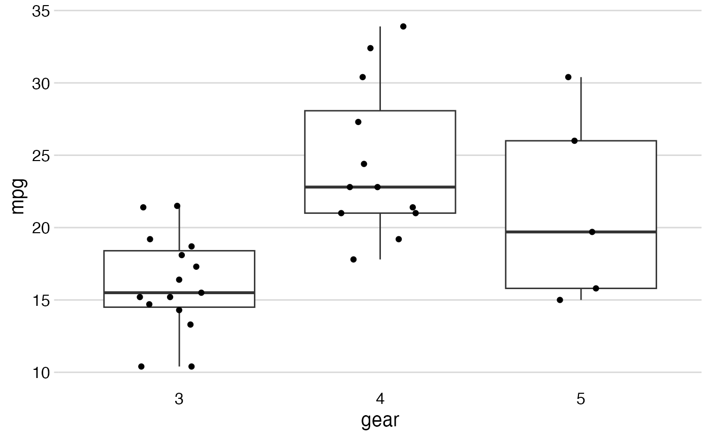
data(mtcars)

# Basic plot
mtcars %>%
  stripplot(x = gear, y = mpg)


# Add mean difference between extreme categories, reduce digits,
# add color by 'wt', add different color scale, and label,
# all using standard ggplot syntax.
mtcars %>%
  stripplot(x = gear, y = mpg,
            contrast = "5 vs. 3 gears", unit = "mpg\n",
            digits = 1, color = wt) +
  viridis::scale_color_viridis(option = "cividis") +
  ggplot2::labs(y = "Miles per gallon", color = "Weight")
# Add mean difference between extreme categories, reduce digits,
# add color by 'wt', add different color scale, and label,
# all using standard ggplot syntax.
mtcars %>%
stripplot(x = gear, y = mpg,
contrast = "5 vs. 3 gears", unit = "mpg\n",
digits = 1, color = wt) +
viridis::scale_color_viridis(option = "cividis") +
ggplot2::labs(y = "Miles per gallon", color = "Weight")
